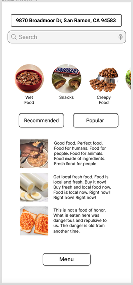
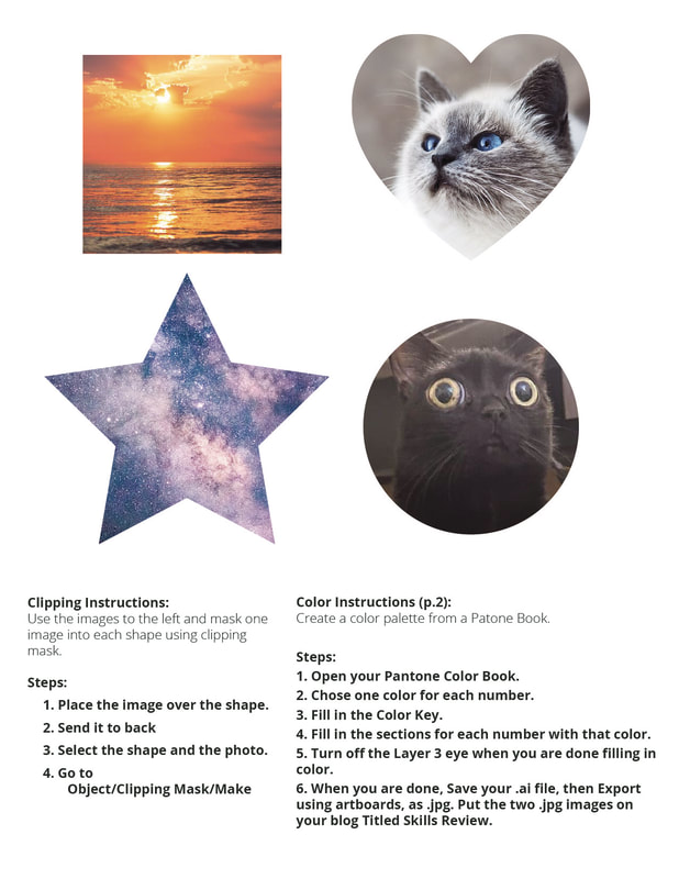
 1. The process of adding graphics was okay. Using the iOS icons from the UI Kit was a bit of a pain, as it was difficult to rescale certain things and the whole design doesn't really feel quite right with the iOS settings icons. Adding the images, however, was fun, and quite simple once I figured it out.
2. The easiest part was probably figuring out what to put in all the categories, for all the images etc. I enjoyed being able to have a little fun and not take the assignment so seriously, for once. 3. Using the UI Kit; see Question 1 4. If "menu items" refers to the food: I thought it was funny. If "menu items" refers to the UI graphics: I just tried to chose whatever seemed like it would go someplace or another. They don't fit super well, but there were some instructions for what icons to use.
0 Comments
Video
1. How do you feel after watching that video? I feel like I could understand her struggles, to some small extent. Not because I'm short - I'm nowhere near her size and don't have any physical disabilities - but there are things that I'm well aware are not designed for me to ever be able to use or do, because I face my own difficulties that make many things harder as well. I agree with the speaker's messages. 2. As a designer, what could be done for Sinéad? More products and services need to be designed with all heights in mind, not just those of average height. She mentions how so many things: from airports to public bathrooms, coffee shops, clothing and even chairs are all extremely difficult for her to use. She, like others who experience dwarfism, want to be able to live more normal lives - not meaning that they wish to be average height, but that they want to not have to struggle doing the things that most people don't even think about. For this reason, public spaces need to be designed to be more accessible to her and to anybody who's disabled - after all, disability accommodations aren't and should not be "one size fits all". 3. When you think about how it is to experience life the way she does, what is that called? Empathy Article 1. List 3 professional fields that are associated with UX design Software engineering, architecture, all sorts of physical product design (ranging all the way from toothbrushes to furniture to cars) 2. Who coined the term "User Experience"? Don Norman 3. What did he study at MIT? Electrical engineering 4. What is the name of his book, the unofficial UX bible? The Design of Everyday Things 5. According to him, what are the two most important parts of good design? Discoverability (the ability to figure out what an object does) and Understanding (the ability to figure out how that object does it / how to use it) 6. What are affordances? "Cues" that wordlessly demonstrate the purpose of an object. Can be visual or non-visual 7. What are signifiers? Visible things that communicate some meaning: e.g. an empty subway station platform suggests that a train just left. 8. What are these? "forming goal - forming intention - specifying action - executing action - perceiving - interpreting - evaluation" Seven Stages of Action 9. What is a potential negative consequence of streamlining? Streamlining products can lead to them becoming "dumbed down" and ultimately can lead to products becoming more disposable in favor of fads. 10. Who said "You've got to start with the customer experience . . . " and why is it important? Steve Jobs said it, and in doing so pointed out the importance of user-centered design. Products are made to be used by the customers: their experiences with the product should be one of, if not the most important parts. Free Response What are two apps with great user experience? This is a bit of a difficult question to answer, as I feel that while our understanding of design and its techniques have definitely improved, firms and companies are increasingly sacrificing good user experience in favor of more easily-monetized experiences. Mobile apps are the worst offenders in this part - because they're free to download, they need to figure out a way to squeeze as much money out of people as possible, which usually involved gratuitous amounts of ads and predatory microtransactions. All of the best "apps" I've seen are usually on desktop, where there's usually a different precedent for monetization (at least, most of the time). Steam, for example, is an application I'd say has quite decent user experience. It's sort of like a virtual marketplace or hub for video games. There's a "store" part where you buy games, a "library" part where you can find all of your games in one place, and a variety of community hubs and forums relating to any game that can be bought on the application. I find that while it does have a number of bugs, I've never really had any complaints about the service being difficult or frustrating to use: it's very streamlined (or should I say steam-lined?). Another application I enjoy is Clip Studio Paint, a type of digital drawing software that I believe is available for both desktop and mobile. While it's fairly complicated to learn compared to some lower-level drawing softwares, it has all sorts of features to make the drawing process easier for creators: they have templates for both illustrations and comics, 3D planes and models that can be used for posing reference, an online service where you can download, buy, or even upload and sell tools like brushes and models, and also makes it really easy to import brushes from other softwares such as Photoshop. I've found that the tools available, particularly the fill tool, are more effective and easy to use than some I've seen in other programs (I used to use a free-to-download drawing program whose fill tool would never reach the edges of a shape - I'd have to spend so much time correcting all the slivers of white within the lineart). But the best part? It's a one-time purchase. That, I think, is one of the most valuable parts of user experience. No microtransactions, no pop-up ads, no ridiculous, continual subscription or membership fees (except for where it makes sense, like in one of those monthly blind box subscriptions), nothing like that. Those sorts of things make it much harder to enjoy (or even want to utilize) digital programs. Made using RGB color scheme to mimic the video & since the icons are meant to be displayed on screens
An infographic resume can be included as a supplement to the traditional resume, such as being included on one's LinkedIn (or similar hiring service) profile, or sent in direct correspondence with a hiring agent. It's not a good idea to submit an infographic resume to an automated system, as it will likely be unable to read the resume.
Resume Writing tips & tricks:
 1. Something new that I learned was...
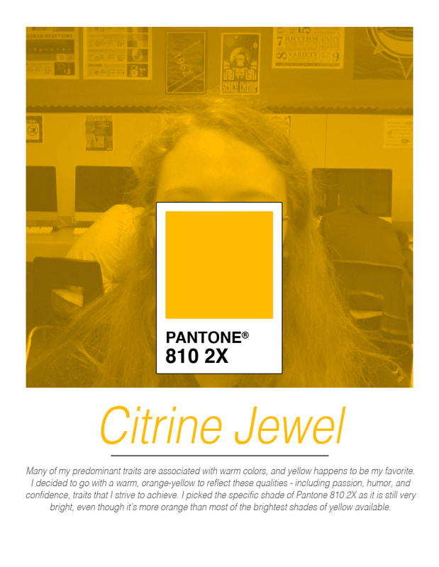
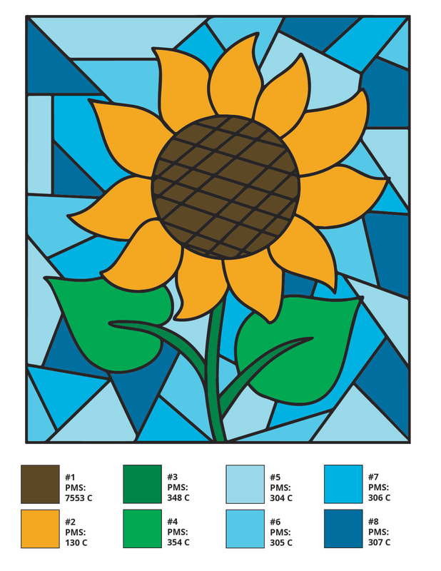
Illustrator's layer blending settings (normal, multiply, blend, etc.) are found in the opacity menu of an object. I'm normally used to it being in its own category, so that was new. I also learned how to use Illustrator's clipping masks - though they're very similar to Photoshop's clipping masks. 2. I'm not surprised that this is my signature color, because... Well, firstly, I'm the one who chose it. Additionally, yellow's been my favorite color for a while and is a color I feel very drawn to. I've always admired its bold, visible, and sometimes kinda tacky appearance - and while I don't always embody those traits, I still appreciate them. 3. A good complimentary color to my signature color would be... Definitely a shade of purple, since that's complimentary to yellow. Perhaps a darker purple such as PMS 268 would go best with the bright shade of my signature color? The contrast of light and dark would help bring out the best qualities of both colors. 4. A good analogous color to my signature color would be... My color is already leaning towards the orange side of yellow, so it would probably look best with another warm color. For example, PMS 150 - a light, desaturated orange that's warm enough to match with my color, but not so bold that it would compete with my shade. 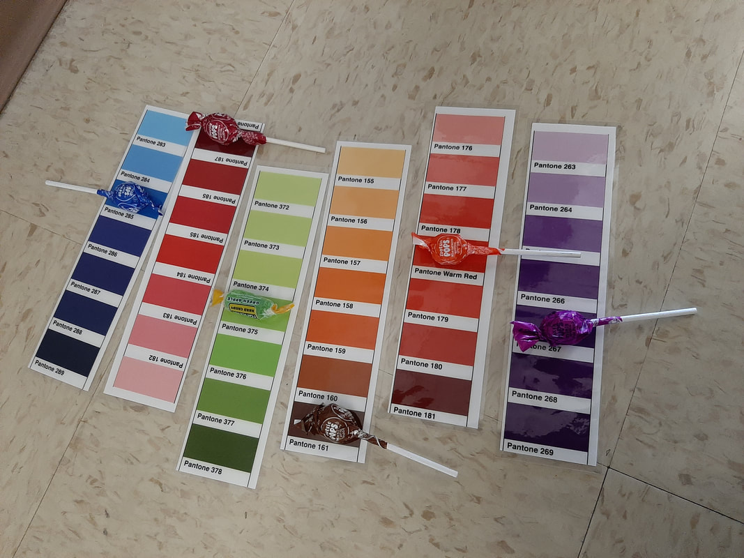 1. It was fairly easy to decipher the colors. The hardest part was picking between different, similar shades. Additionally, the purple candy was difficult to find as the saturated purple hue that composes most of its wrapper wasn't on any of the Pantone sheets. We instead decided to match it with the color of the darker purple text on the wrapper.
2. Pantone makes it easier to get consistent colors across a design, and can be used to compare various "families" of shades. The Pantone Matching System produces the most accurate and consistent shades possible, which is best for professional printing and designs. 3. Pantone colors would be best used in class for projects that focus greatly on the use of color, such as logos, as well as projects that are designed to be printed. It would probably be best to use Pantone for solid-color designs, as gradients and the like are harder to assign shades to. 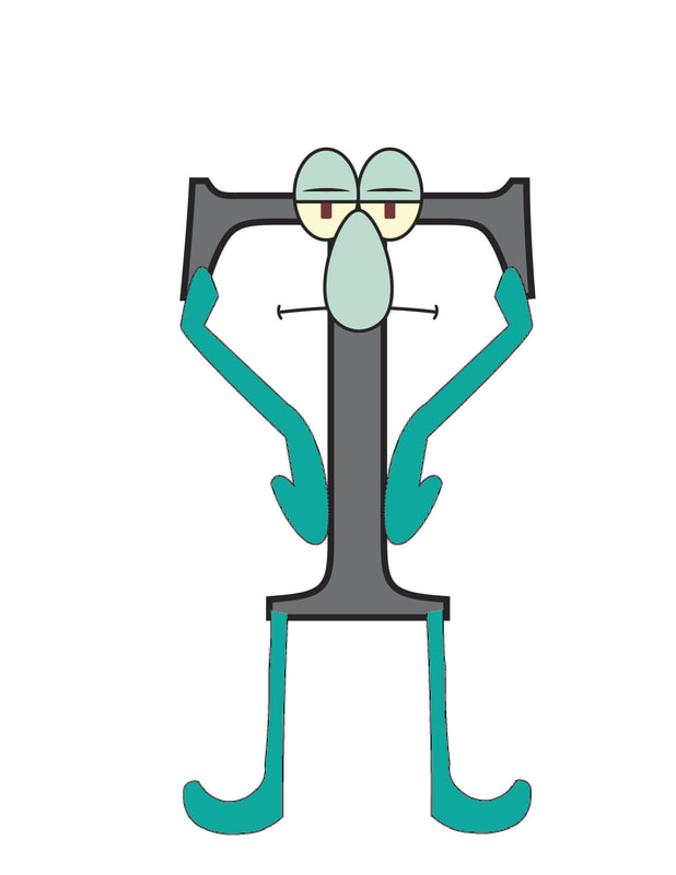 Body: Matin Masarrat Bakhsh
Limbs: Zeyad Elagroudy Head: Jewel Hickman Icons and descriptions Alternate color version I tried to use a simple, geometric and symmetrical style for each of my icons. Each one has an equilateral polygon as the base of the symbol, with the number of sides incrementing as one goes to the right (4 sides, then 5 sides, then 6 sides). The outsides of the shapes are generally sharp, whereas the interiors have softer shapes. I also made each icon one of the true primary colors - yellow, cyan, and magenta, to reflect how they combine to form my full identity, in the same way that the primary colors combine to create all other colors. I also used thick lines to complement the simple designs.
If I could change anything I did, I might make the eyelashes on the eye angular rather than curved. In the future, I'd like to play around with making more complicated and/or asymmetrical designs, too, since those can be very beautiful and meaningful. I always feel a little embarrassed trying to describe or represent myself to the public, which is why I tried to keep these designs simple and straightforward. If I can one day get over that fear, I think I'd be able to come up with even better ideas and iconography. |
Jewel HickmanNon-Worm Archives
May 2022
Categories |
 RSS Feed
