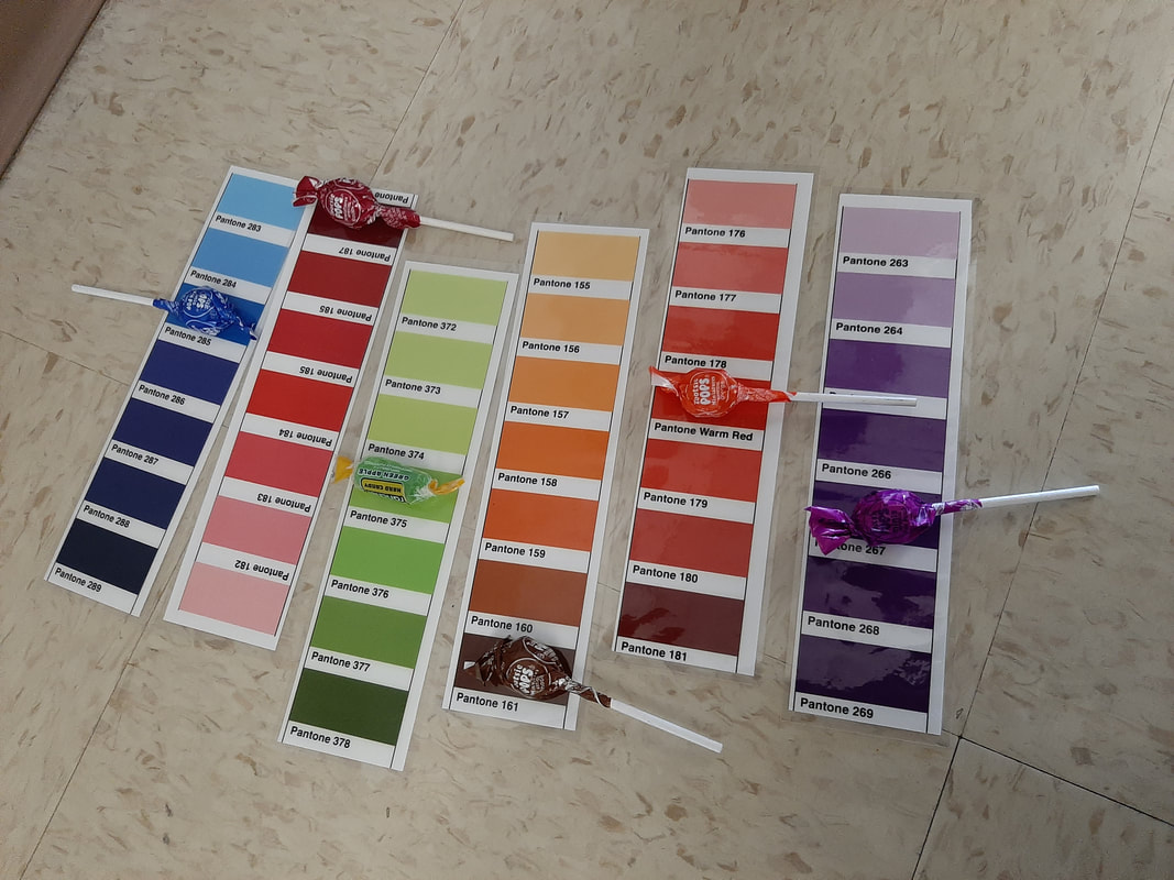
 1. It was fairly easy to decipher the colors. The hardest part was picking between different, similar shades. Additionally, the purple candy was difficult to find as the saturated purple hue that composes most of its wrapper wasn't on any of the Pantone sheets. We instead decided to match it with the color of the darker purple text on the wrapper.
2. Pantone makes it easier to get consistent colors across a design, and can be used to compare various "families" of shades. The Pantone Matching System produces the most accurate and consistent shades possible, which is best for professional printing and designs. 3. Pantone colors would be best used in class for projects that focus greatly on the use of color, such as logos, as well as projects that are designed to be printed. It would probably be best to use Pantone for solid-color designs, as gradients and the like are harder to assign shades to.
0 Comments
Leave a Reply. |
Jewel HickmanNon-Worm Archives
May 2022
Categories |
 RSS Feed
